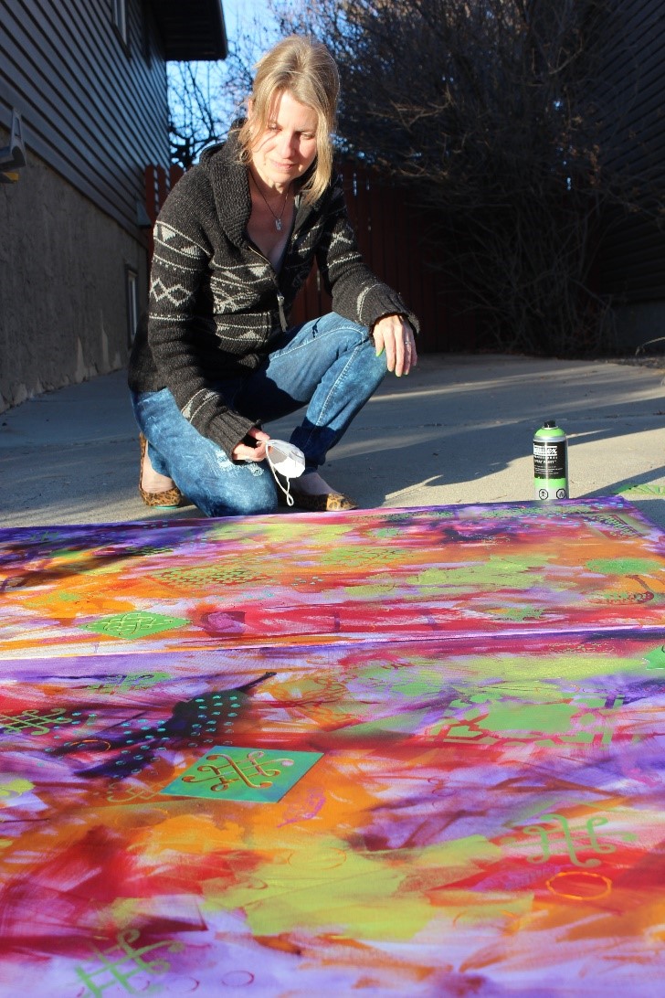
Inspired by graffiti, we will begin by utilizing acrylic paint, stencils, stamps or other mark-making tools to create a vibrant background. We will explore colour and contrast, while adding interest through mark-making in order to capture a vibrant city scene.
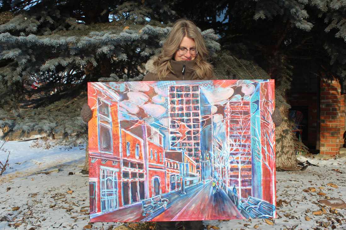
My husband works in thriving downtown location and during his daily walks will often take photographs of interesting buildings for me. I often like to sketch the images in a small travelling Moleskine before painting as I find that I can stretch my creativity when I don’t feel bound to a photograph. My colour choices become much more vibrant and I don’t tend to focus on details.
I called this body of work that focuses on these scenes ‘CityScapes’ but recognize that this same method could be used on houses, which I think would be lovely. Perhaps I’ll have to paint my home sometime.
A large part of the work I do is based on a highly patterned ground as, even after all these years, I still can tend to feel intimidated by a blank canvas.
Tools & Materials:
- Stretched canvas, panel or paper
- Acrylic paints
- Flat & round paint brushes
- Water dish
- Rag
- Stencils & other mark-making tools (optional)
- I used different sizes of paint brushes to create different types of marks.
- A stencil brush and acrylic paint can be used to add interesting patterns.
- If using paper, I suggest coating it with a layer of white gesso to add texture and substance to the surface though I did not.
- Clean water dish regularly to keep paint colours vibrant (another rule I don’t always follow).
- Apply thin layers of colour to the canvas.
- Allow to dry well in between layers in order to keep colours vibrant.
- Once that layer has dried, take your stencils and spray paint to a well-ventilated area and begin adding patterns. Pay attention to repeating pattern and colour around the canvas in order to keep the image interesting and the viewer’s eye moving around the surface.
- Once the canvas has dried (a heat gun or blow drier can help to speed things up) I like to use a thinned white paint and a round brush to draw my image on my prepared canvas.
- Once this layer has dried, I typically use layers of pthalo or Prussian blue or dioxazine purple thinned with water to capture the shadow areas. In this case I also used a glaze of thinned alizarin crimson to represent the colour of the bricks.
- At this point, I paint a variety of translucent and opaque colours in and around the images in order to make the object ‘pop’.
- Each layer dries well, I also use rulers and acrylic paint markers to straighten up my buildings as they can be a bit ‘wonky’, though I do like to keep them quite organic, and also to add more pattern and colour.
- I repeat these steps until I am happy with the final image.