There are many ways to draw a portrait: by eye…just looking and paying attention to the shapes and shadows on a face. There are certain proportions to pay attention to like the fact that the head is typically an oval shape with adjustments to the jawline; eyes are about ½ way down the face shape instead of near the top of the head; the width of a head is about 5 eye shapes with the eyes being in the second and fourth measurement; the bottom of the nose is about ½ way between the eyes and bottom of the chin; the lips about ½ way between nose and chin; ears sit approximately even with the top of the eyes and bottom of the nose; the nose width is approximately straight down from the inner edge of each iris. DaVinci used a camera lucida which reflects the image onto your surface using mirrors (they are still available to purchase as well as downloadable apps) and Albrecht Durer used a piece of glass with a grid, I use the grid without the glass. I like to upload an image onto my computer or tablet and download a grid then draw the image block by block onto paper. Or you can print an image and trace it using graphite paper (it's available in many colours) or carbon paper from a office supply store, which is what I share in high schools for a simpler, quicker portrait. These are just a few different tools an artist uses in order to create.
For several years I have continued the practice of creating a small painting a week following a particular theme. As a practicing artist I have found that working in series is great for so many reasons…not only to increase my skills and to challenge myself but also to have a focus and to learn to speak more clearly about what I do. It’s also great to try new methods of working and new materials. Last year my youngest daughter encouraged me to focus on portraits as I hadn’t really worked on them since college a long, long time ago and so I began to paint the women who had impacted me in some way, titled ‘Heroes’. Each week on my website I shared their images, their words and the story of how they influenced me. They can be viewed under the portfolio on my website.
SUPPLIES:
White gesso
Paintbrushes (3/4” flat + ¼” round)
Stencils & rubber stamps
Acrylic spray paint + mask (optional)
Carbon paper + pen
White Signo Uni-ball pen or Sharpee (optional)
Acrylic paint (warm & cool colours & white – see below)
Heat gun or blow dryer (optional)
Water dish
Spray bottle
Rag
PREPARATION
The first step is to find a portrait that you connect with…when I created my 52 WEEKS::Heroes series, I focused on the women throughout history that influenced me and my daughters. When I began the series I hadn’t included quotes by them, but found that the further along that I was in the project, it was their words that resonated with me and so I began to include them with the images. The image you use can be printed on a printer or taken from a magazine, but be sure to have a larger face as it is easier to delineate features along with shadows on larger images rather than smaller ones.
PREPARING YOURS JOURNAL
I begin working in my journal by covering the page with gesso as this creates and nice chalky surface for the paint while keeping the page from buckling too much. I like to leave lovely brush marks using the gesso as the base. This has to dry for at least an hour.
While my pages are drying, I suggest researching the portrait. Whenever I research a project, I initially like to quiet and center myself to pay attention to the image I have collected. I like to use a form of journaling known as free writing, just writing as thoughts come to me while I consider a few questions:
Now I always pay attention to how these images help me to tell my own story:
STEP 1
Though I do enjoy preparing my surface, I really have fun once I start adding colour. Some of my favorite colours for beginning artwork are the heavy staining ones such as alizarin crimson, pthalo or Prussian blue, quinacridone magenta and dioxazine purple. I tend to prefer heavy body paints as they can be thinned with water or thinning mediums.
One of my favorite ways to fill a surface with colour is to thin paint with a little water and brush it onto the surface, spray it with water and then allow to sit for a moment. Then, I tilt the surface to allow the paint to run down. I still manipulate the paint with my brush but it’s the drips that interest me. Add a few colours and allow to dry.
NOTE: If you don’t want muddy colours like greys or browns, use a layer of warm (orange, yellow, red) allow to dry (or dry with heat gun or hair dryer) and followed by a layer of cool (blue, green, purple), or vice versa. You can repeat these steps for several layers of colour and pattern. For each layer, I chose to use two colours – for the first layer I used cadmium yellow medium and alizarin crimson; for the second, vivd lime green and a turquoise spraypaint; followed by cadmium orange and medium magenta.
STEP 2
At this stage I like to bring my work outside to spray paint some stencil patterns onto the base. I intuitively place my stencils over the base and as I spray paint I lift each and turn it over in order to get the reverse stencil on the surface. I never worry about creating a perfect image as I love the imperfect appearance of street art or graffiti, which has been a huge influence in my work for several years. Note that you must always wear a mask and work in a well-ventilated are when using spray paint.
OPTION: Use a foam brush or make up sponge to dab paint through a stencil or use rubber stamps and thinned paint to add pattern.
STEP 3
Once the base has dried extremely well (you can use a heat gun or blow drier to hurry the process), take the photocopy or magazine image (I decided to use a photo of myself this time), place the carbon paper behind it with the dark side against the sketch book. Decide where you would like your image to sit on the page. Typically, a surface is mentally split into thirds and the image added to one of those sections to be visually pleasing. Tape this to your sketchbook and, using your pen, draw around the outline and main features of your image. I also outline shadow areas. You can remove the tape from three sides and lift while you work to view how well the image is transferring and if you have transferred enough information.
STEP 4
I begin adding shadows using translucent acrylic paint thinned with water (in this case pthalo blue) to give form to my shape paying attention to which direction the light would be coming from. I use this dark colour for the eyes and hair as well. At this stage I use the acrylics more like a watercolour paint in that I layer thin washes of colour until I get the shades of dark that capture the shadows and dark areas (such as eyes) that I note in the original photograph.
STEP 5
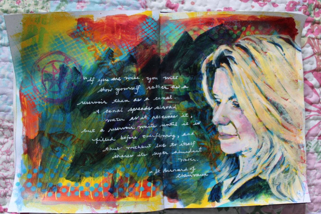
I then begin adding highlights by mixing unbleached titanium, titanium, a bit of cadmium orange and cadmium yellow medium for pale skin tones (or burnt umber with a bit of pthalo blue or dioxazine purple and unbleached titanium for darker skin tones). I keep working back and forth with layers of thinned paint for shadows and lighter mixes for highlights. I also go back into the portrait with washes of pthalo blue and deep magenta. My final step on the portait is to add a white dot in the eyes for a highlight. I also use a wash of a transparent colour (in this case pthalo blue) to paint around the image in order to increase the contrast and highlight the portrait.
STEP 6
After the image has completely dried (I usually give it 24 hours), I will add some of the information I’ve gathered on the person in order to use this as a guide in my life. An alternative is to journal around the image in your own words or with your favorite quote. Some of my favorite writing implements are paint pens (the white signo uni-ball pen), Sharpees and a calligraphy or fine liner paintbrush.
I find that whomever I connect with shares my story in some way. They are not only a guide, but also a reminder of the strength of our own story and share the value that each one of us brings to this life.
For several years I have continued the practice of creating a small painting a week following a particular theme. As a practicing artist I have found that working in series is great for so many reasons…not only to increase my skills and to challenge myself but also to have a focus and to learn to speak more clearly about what I do. It’s also great to try new methods of working and new materials. Last year my youngest daughter encouraged me to focus on portraits as I hadn’t really worked on them since college a long, long time ago and so I began to paint the women who had impacted me in some way, titled ‘Heroes’. Each week on my website I shared their images, their words and the story of how they influenced me. They can be viewed under the portfolio on my website.
SUPPLIES:
White gesso
Paintbrushes (3/4” flat + ¼” round)
Stencils & rubber stamps
Acrylic spray paint + mask (optional)
Carbon paper + pen
White Signo Uni-ball pen or Sharpee (optional)
Acrylic paint (warm & cool colours & white – see below)
Heat gun or blow dryer (optional)
Water dish
Spray bottle
Rag
PREPARATION
The first step is to find a portrait that you connect with…when I created my 52 WEEKS::Heroes series, I focused on the women throughout history that influenced me and my daughters. When I began the series I hadn’t included quotes by them, but found that the further along that I was in the project, it was their words that resonated with me and so I began to include them with the images. The image you use can be printed on a printer or taken from a magazine, but be sure to have a larger face as it is easier to delineate features along with shadows on larger images rather than smaller ones.
PREPARING YOURS JOURNAL
I begin working in my journal by covering the page with gesso as this creates and nice chalky surface for the paint while keeping the page from buckling too much. I like to leave lovely brush marks using the gesso as the base. This has to dry for at least an hour.
While my pages are drying, I suggest researching the portrait. Whenever I research a project, I initially like to quiet and center myself to pay attention to the image I have collected. I like to use a form of journaling known as free writing, just writing as thoughts come to me while I consider a few questions:
- What is it about this image that appeals to me?
- Which colours jump out and why?
- Is there a phrase or feeling that runs through my thoughts?
- What is it about that specific image that I connect with…personality, pattern or form?
- If colours are catching my attention, what do the colours symbolize? If pattern, does it remind me of something else? If form, does its form replicate a form that I am surrounded by? Does it bring up memories?
Now I always pay attention to how these images help me to tell my own story:
- How does this speak to me?
- Is there an area of my life that this speaks to directly?
- How can I apply this guidance?
- Where can I make changes in my life to be more like this?
- What does my spirit tell me about this image?
STEP 1
Though I do enjoy preparing my surface, I really have fun once I start adding colour. Some of my favorite colours for beginning artwork are the heavy staining ones such as alizarin crimson, pthalo or Prussian blue, quinacridone magenta and dioxazine purple. I tend to prefer heavy body paints as they can be thinned with water or thinning mediums.
One of my favorite ways to fill a surface with colour is to thin paint with a little water and brush it onto the surface, spray it with water and then allow to sit for a moment. Then, I tilt the surface to allow the paint to run down. I still manipulate the paint with my brush but it’s the drips that interest me. Add a few colours and allow to dry.
NOTE: If you don’t want muddy colours like greys or browns, use a layer of warm (orange, yellow, red) allow to dry (or dry with heat gun or hair dryer) and followed by a layer of cool (blue, green, purple), or vice versa. You can repeat these steps for several layers of colour and pattern. For each layer, I chose to use two colours – for the first layer I used cadmium yellow medium and alizarin crimson; for the second, vivd lime green and a turquoise spraypaint; followed by cadmium orange and medium magenta.
STEP 2
At this stage I like to bring my work outside to spray paint some stencil patterns onto the base. I intuitively place my stencils over the base and as I spray paint I lift each and turn it over in order to get the reverse stencil on the surface. I never worry about creating a perfect image as I love the imperfect appearance of street art or graffiti, which has been a huge influence in my work for several years. Note that you must always wear a mask and work in a well-ventilated are when using spray paint.
OPTION: Use a foam brush or make up sponge to dab paint through a stencil or use rubber stamps and thinned paint to add pattern.
STEP 3
Once the base has dried extremely well (you can use a heat gun or blow drier to hurry the process), take the photocopy or magazine image (I decided to use a photo of myself this time), place the carbon paper behind it with the dark side against the sketch book. Decide where you would like your image to sit on the page. Typically, a surface is mentally split into thirds and the image added to one of those sections to be visually pleasing. Tape this to your sketchbook and, using your pen, draw around the outline and main features of your image. I also outline shadow areas. You can remove the tape from three sides and lift while you work to view how well the image is transferring and if you have transferred enough information.
STEP 4
I begin adding shadows using translucent acrylic paint thinned with water (in this case pthalo blue) to give form to my shape paying attention to which direction the light would be coming from. I use this dark colour for the eyes and hair as well. At this stage I use the acrylics more like a watercolour paint in that I layer thin washes of colour until I get the shades of dark that capture the shadows and dark areas (such as eyes) that I note in the original photograph.
STEP 5
I then begin adding highlights by mixing unbleached titanium, titanium, a bit of cadmium orange and cadmium yellow medium for pale skin tones (or burnt umber with a bit of pthalo blue or dioxazine purple and unbleached titanium for darker skin tones). I keep working back and forth with layers of thinned paint for shadows and lighter mixes for highlights. I also go back into the portrait with washes of pthalo blue and deep magenta. My final step on the portait is to add a white dot in the eyes for a highlight. I also use a wash of a transparent colour (in this case pthalo blue) to paint around the image in order to increase the contrast and highlight the portrait.
STEP 6
After the image has completely dried (I usually give it 24 hours), I will add some of the information I’ve gathered on the person in order to use this as a guide in my life. An alternative is to journal around the image in your own words or with your favorite quote. Some of my favorite writing implements are paint pens (the white signo uni-ball pen), Sharpees and a calligraphy or fine liner paintbrush.
I find that whomever I connect with shares my story in some way. They are not only a guide, but also a reminder of the strength of our own story and share the value that each one of us brings to this life.