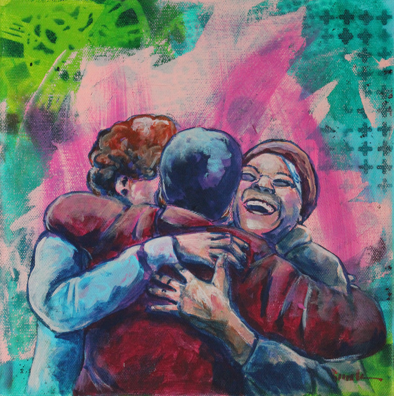
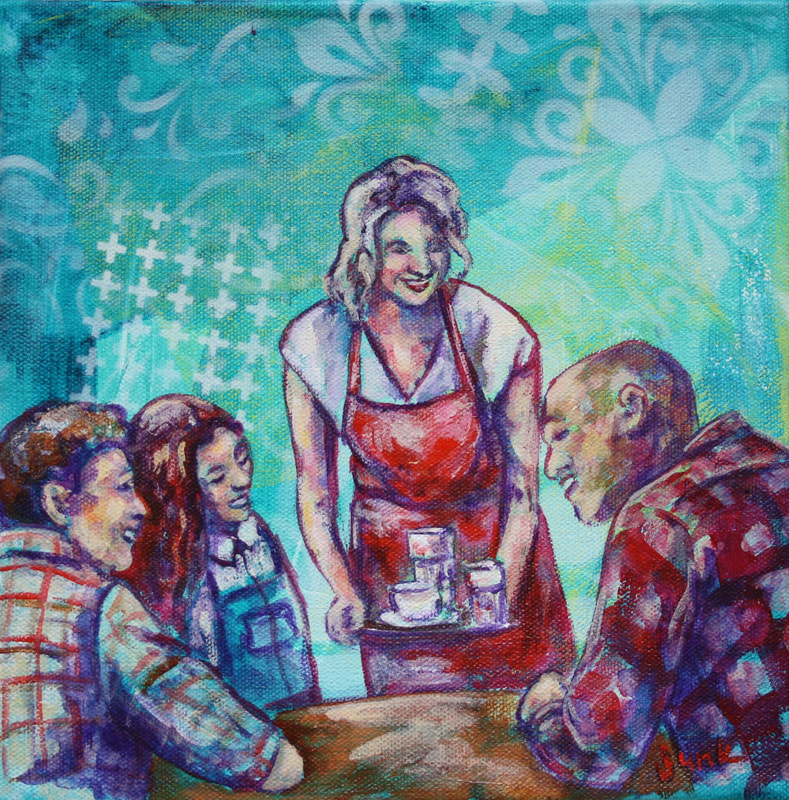
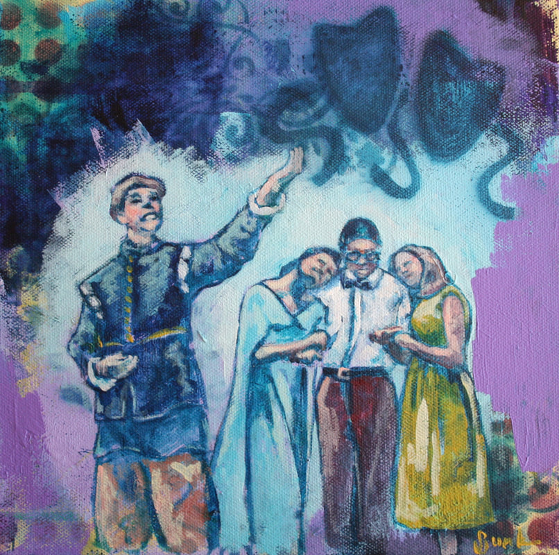
 I recently created another award for AirdrieLIFE magazine's annual Amazing Airdrie Women Awards. At this fantastic event, Blessingways Family Wellness was the recipient this year so I incorporated a few symbols to represent them, including their colours of purple and orange and images representing the pregnant women and children that the practice focuses on. I also included hearts for their logo and the colours to represent warmth, brightness, happiness & welcome. The colour orange also symbolizes spirituality, which I feel encapsulates the holistic practices of chirporactic & massage therapies. My previous paintings were created for Community Links, Chamber of Commerce, Bert Church High School & Bert Church Theatre.
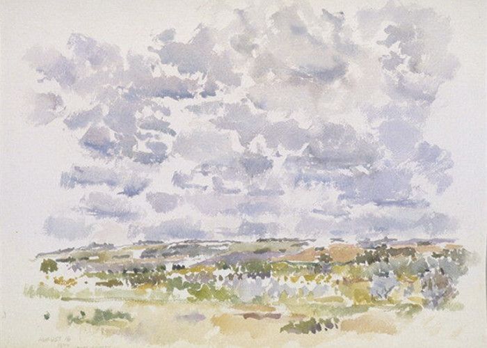
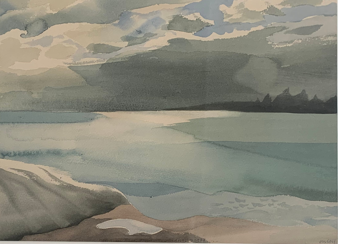
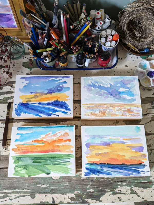
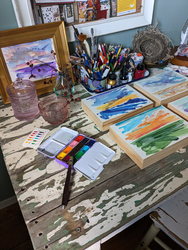 I've been mounting some of my watercolours onto wood...one onto a panel that I've framed in gold and the other 4 onto deep cradled panels. I love how they look. The images are direct painted landscapes (no prior drawing) based on processes I have loved by Canadian artists Toni Onley & Reta Cowley. I only learned about Reta recently as I had forgotten a pencil on a plein air trip and a generous artist mentioned her...she lived in a tiny house in Saskatoon and took full and half sheets of watercolour paper out into the prairies with her. Toni was an artist from British Columbia who would fly to remote places to paint...he used very limited supplies including 1/4 sheets of watercolour paper and a Chinese bamboo brush which he would bury once it had been used up as it was totally organic.
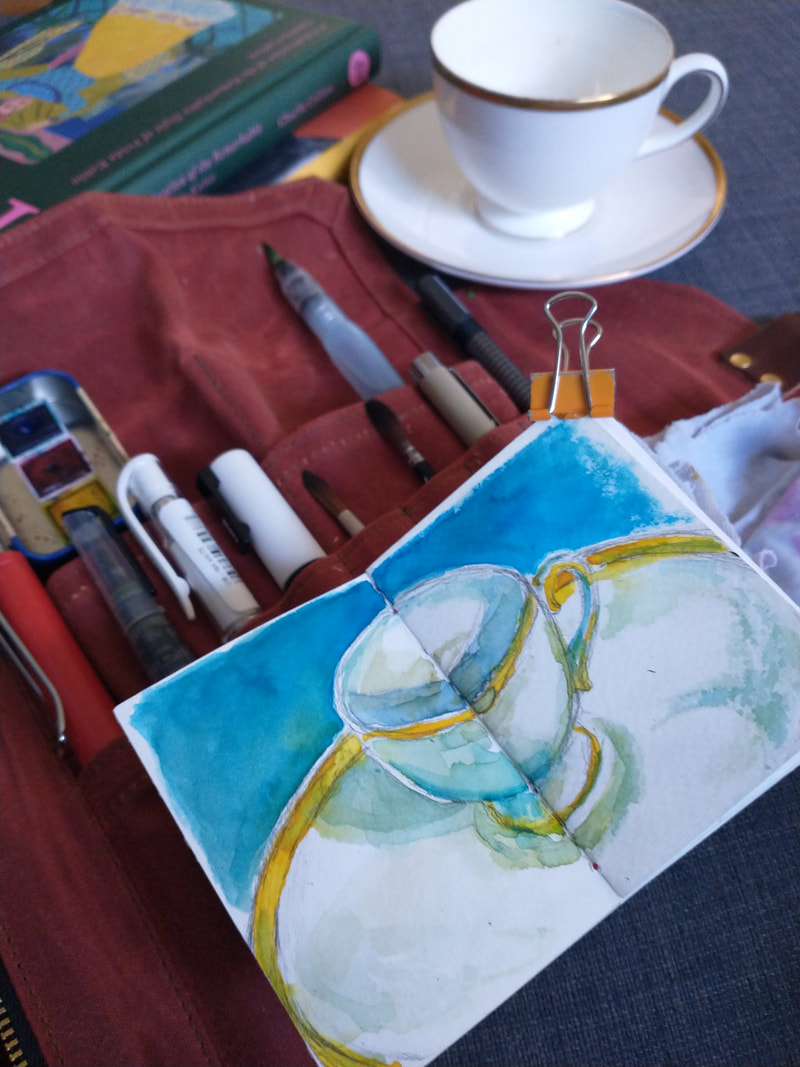
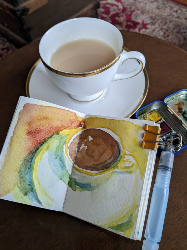
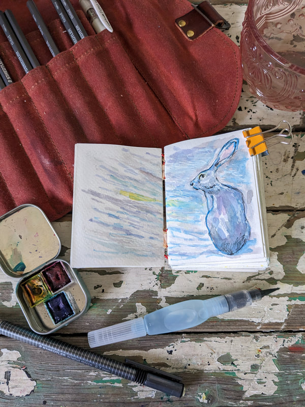
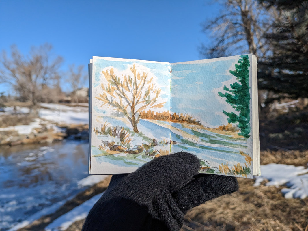
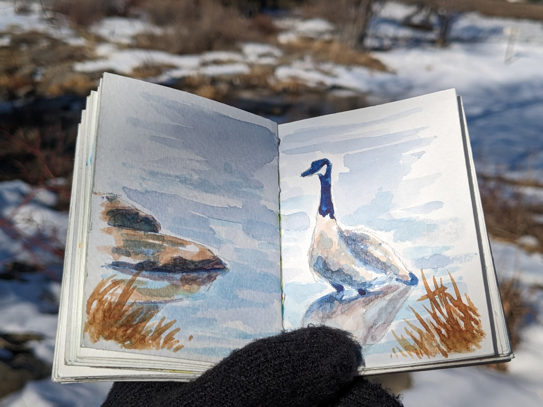
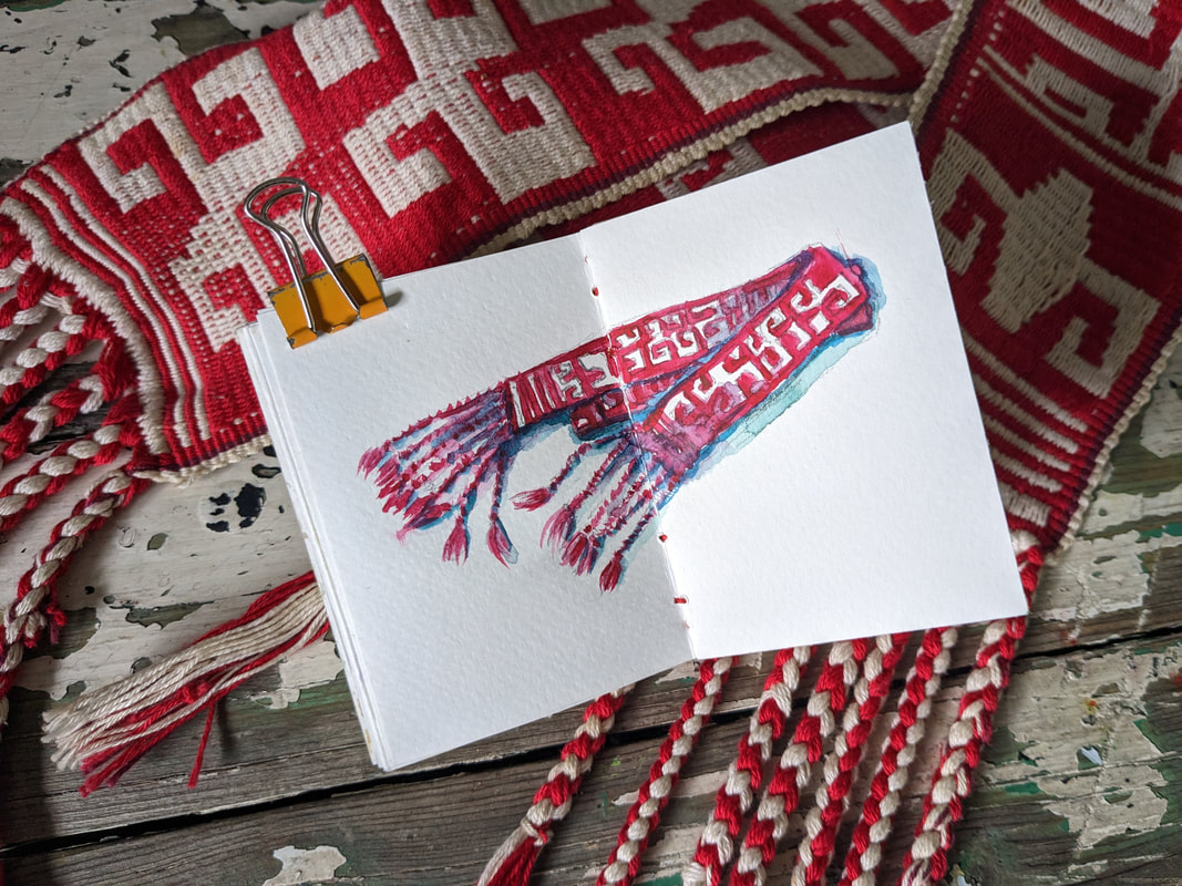
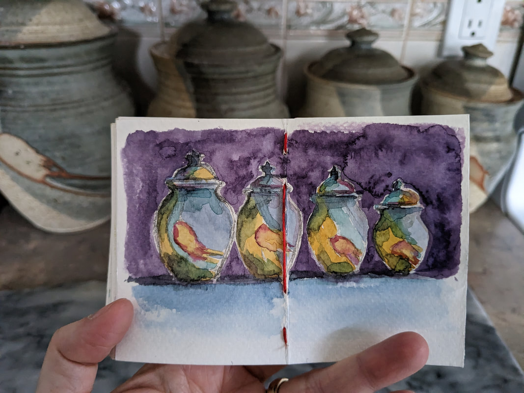
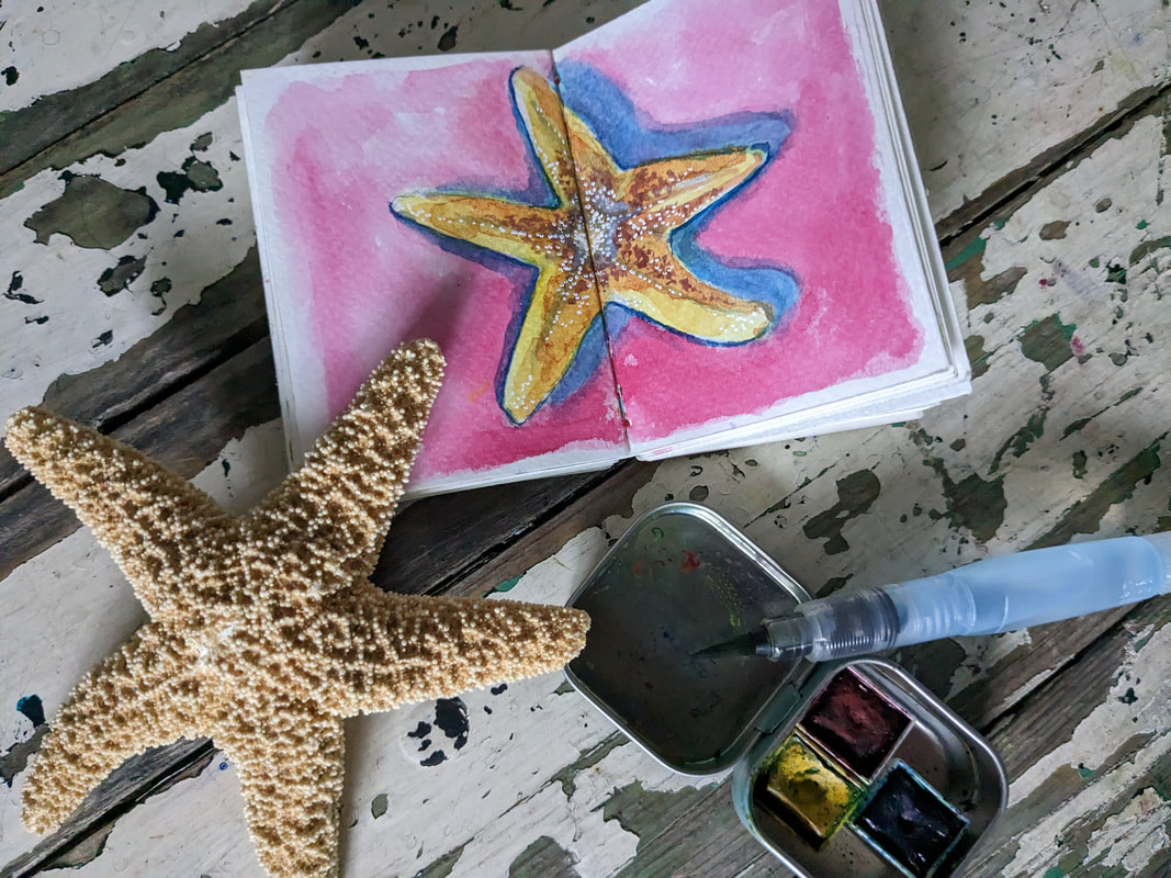
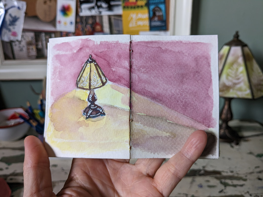
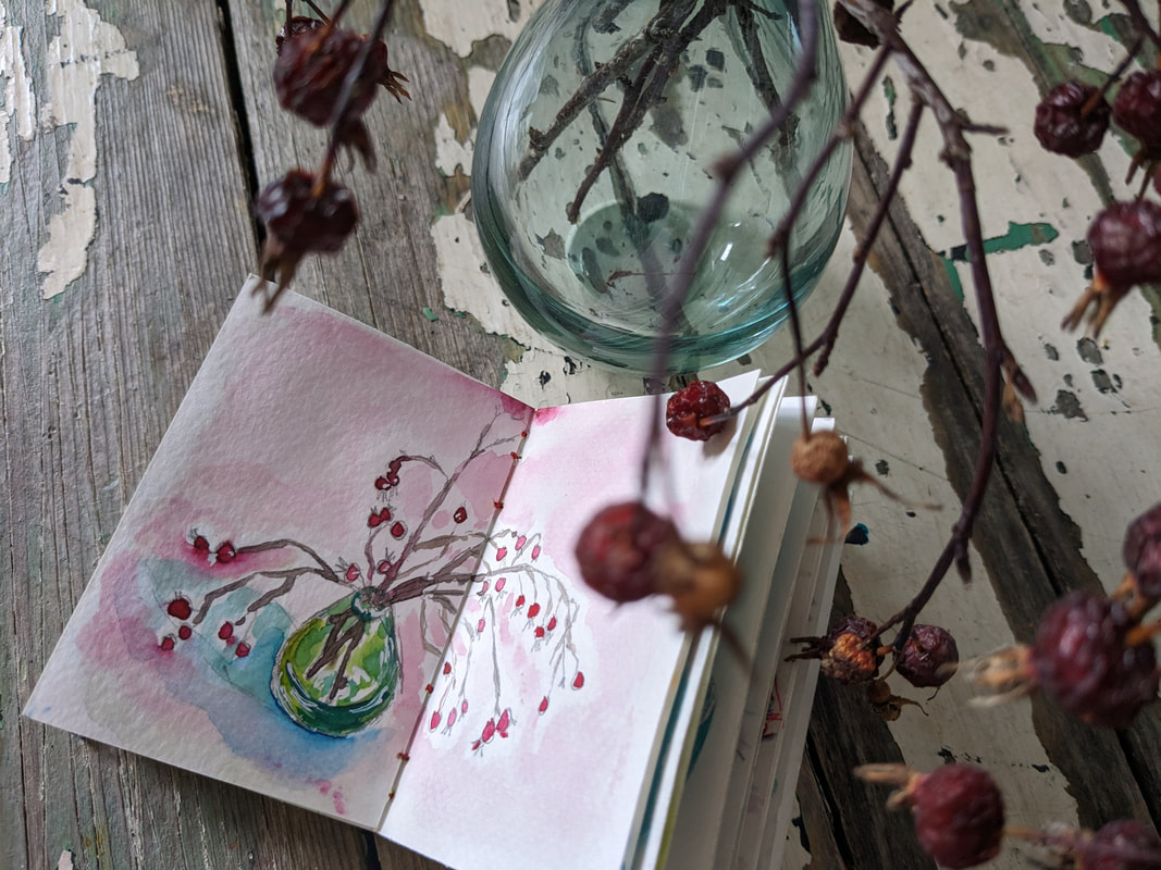
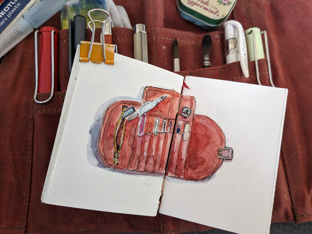
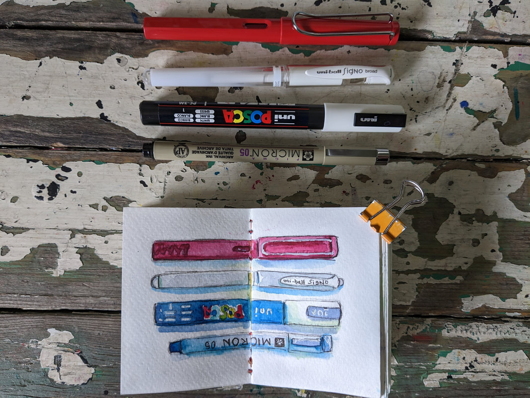
 I've been having so much fun with the miniature watercolour sketchbook I created. Though I've been making a point of painting things that I notice around me from my daily life, there is absolutely no pressure to work in it unless I feel like it...and I have felt like it quite a bit. It's always ready to grab and go and is quite simple as I've mostly used a mechanical pencil, a waterbrush and a tiny mint tin filled with three primary watercolours. I'm always amazed by how much you can accomplish with so little. 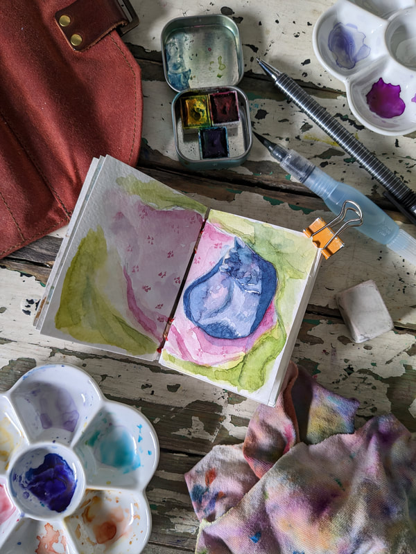 Awhile ago I created my own mini sketchbook when I followed the video posted by Peg & Awl and I absolutely love it! My parameters for it were to paint something in my life each time I pulled it out and to use a limited palette...just like the 100 Day Project of portraits, I decided to use the Joan of Art primaries. I love the little Jane Austen mint tin that I found in San Francisco as it fits so neatly into the Sendak Artists' Roll from Peg & Awl along with a mechanical pencil, white pen and fountain pen filled with red ink. I also have a few watercolour pencils in it as well but haven't used them yet. So, my supplies really are limited...primary watercolours, Pentel waterbrush & Staedtler mechanical pencil. This week I decided to paint our cat Walter as he always looks so cozy, he basically melts in the sunshine. :)
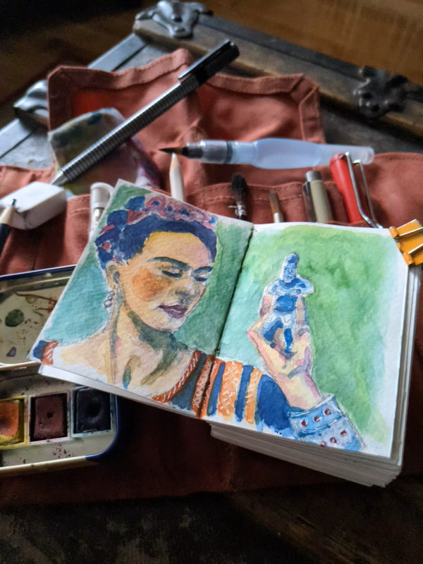
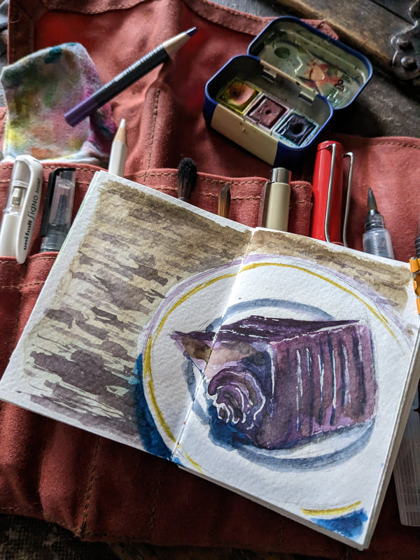
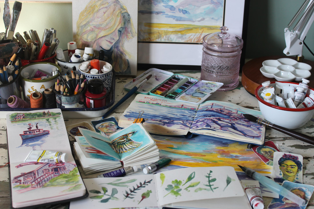 Over the past 2 years I've made a huge shift back to working in sketchbooks regularly and it's been very good. I developed some bad habits over the years, becoming very comfortable with my subject matter and media but, this shift to watercolour on paper has actually been really great. I've been forced to slow down and look closely. And I have to say that I had been moving to a more minimal way of working, so this has been perfect. I've always been intimidated by watercolour and struggled with the thought of the colours being less vibrant than acrylics, but as I've been learning, I have come to appreciate both...and understanding new ways of applying the paint, and also learning the properties of different types and pigments. Plus, exposure to different types of papers and brushes have been eye-opening. My favourite is hot pressed as I love how the paint puddles and seems to glow on its flat surface. I've also been surprised that I am drawn to the Speedball sketchbooks as the pages are a bit thinner and the paper is cream when I typically prefer bright white. So, like I share in my workshops, it really is all about trying different things until finding that sweet spot.
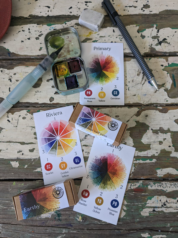 It took a long time to recognize what I prefered to use to create artwork. This shift to watercolour has been no different as now I've had to figure out which papers, brushes and watercolours I prefer. Right now I'm loving the Joan of Art watercolours as they are vibrant and reactivate easily as they don't require a lot of water and a little bit goes a long way. Plus, I love that it is a woman-owned business in B.C. which is right next door to Alberta.
Other than this brand, I also love my Jane Davenport Brights which I purchased on sale many years ago in order to paint while travelling. My third favourite is the White Nights watercolours and that is probably because they are full pans and also vibrant and easily reactivated. I'm surprised that the natural watercolours aren't a favourite, but that is mostly because of the gritty texture they leave behind on the paper. I'm also finding that many of the honey based watercolours aren't a favourite either because they take so long to dry and stay a bit sticky in the pans. Derwent and gouache paints tend to be a bit opaque for me at the moment, which is another surprise since I am originally an acrylic painter. Plus I find that tubes of gouache (traditional and acrylic) tend to be a bit 'grippy' on the paper (I love smooth flowing paint) and I'm not a fan of the scent. I do like Daniel Smith but they also tend to take a bit to reactivate and I find that Winsor & Newton is not vibrant enough for me. All in all this experiment has taught me that what works for someone else may not work for me as I have certain expectations. And it's not just the type of paint that matters to me, but also the container that it is stored in...currently my favourites are tiny mint tins that I can take with me anywhere I go.. Which is why I'm looking forward to sharing my supplies in upcoming workshops so that others can try them, too. 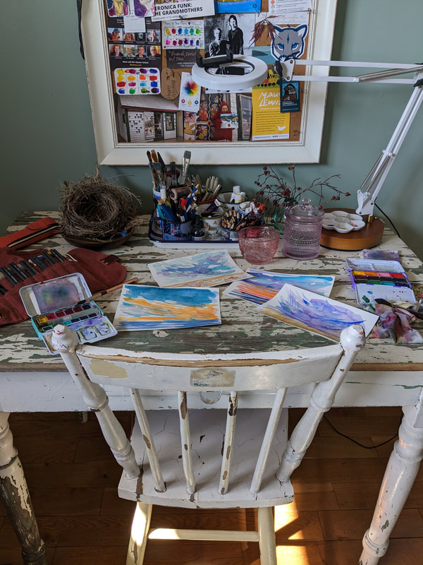 Since I moved my studio upstairs I have been loving it! I know I've worked in this space in the past but it was challenging while I worked on large canvases and large acrylic painting projects. Now that I'm working on small watercolours it suits my needs perfectly. I do love having a typical small table and drafting table so that I can work on multiple items or projects at once and so that I can have the option of sitting or standing when I work. Plus, I love the fact that the table is so old (about 100 years) and fits so well with the old chair I picked up in the alley 15 years ago. There is also an antique china cabinet in the room which works wonderfully to store finished paintings. Currently it is housing the 'Woman's Work' project which will be exhibited at Sparrow Artspace in Calgary in June. And the natural light is phenomenal. My environment is such an important part of my creative process so having a space that is minimal, bright and complete with antiques makes me very happy.
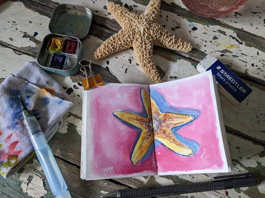
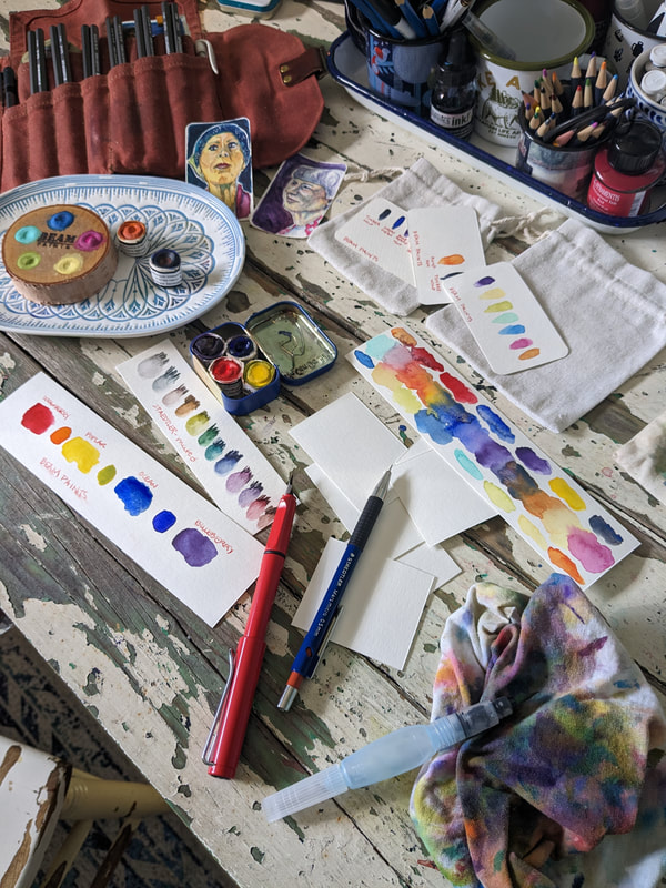 One of my favourite things to do is to swatch colours. It's a great way to become familiar the properties of my paints and I think it's pretty, too. Plus, and this is a fantastic bonus, there are no mistakes in swatching. :) I like to use my waterbrush, large and small brushes with water, trial colours on different types of paper (ie. mixed media, hot and cold pressed watercolour papers), and try different colour mixes. I also try out blooms and bleeds and salts and tissue to create different visual textures. Then, once I'm done, I tend to put these colourful little papers away for a future altered book project, so that for me is a win-win. Plus it's a fantastic way to use up scraps.
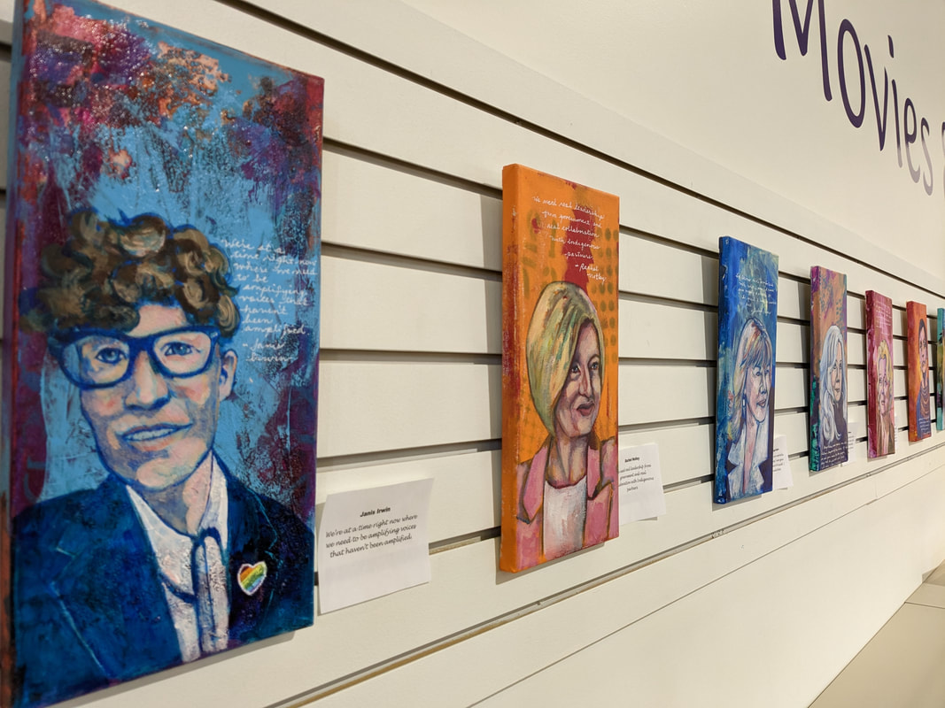
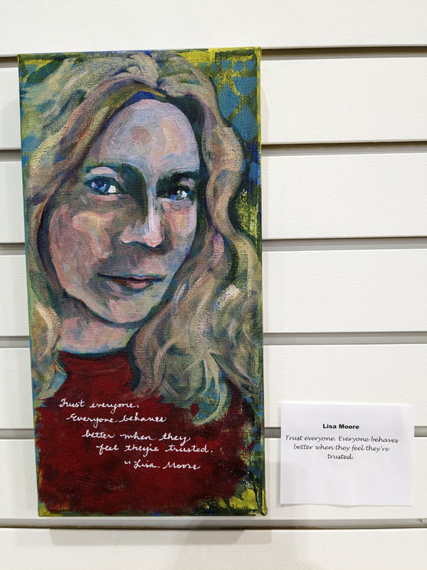
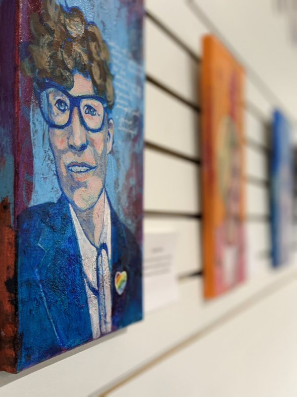
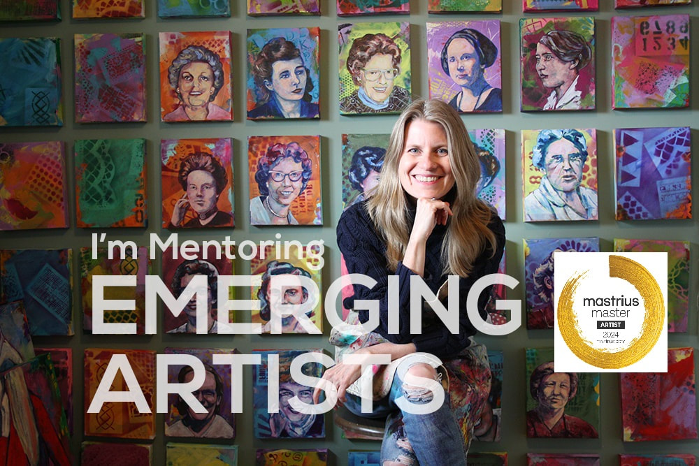
After 5 months the 'Extraordinary Women' portrait project at the Airdrie Public Library is now complete. I haven't yet decided where this exhibit will travel, but I feel that it's an important one that should be seen. So, now it's time to finish preparations to exhibit the 'Woman's Work' project in Calgary in June. I will also be teaching 2 afternoon workshops during my residency at Sparrow Artspace...both introductory, one on travel journalling and the other on watercolour portraits. I'm really looking forward to them.
|
|