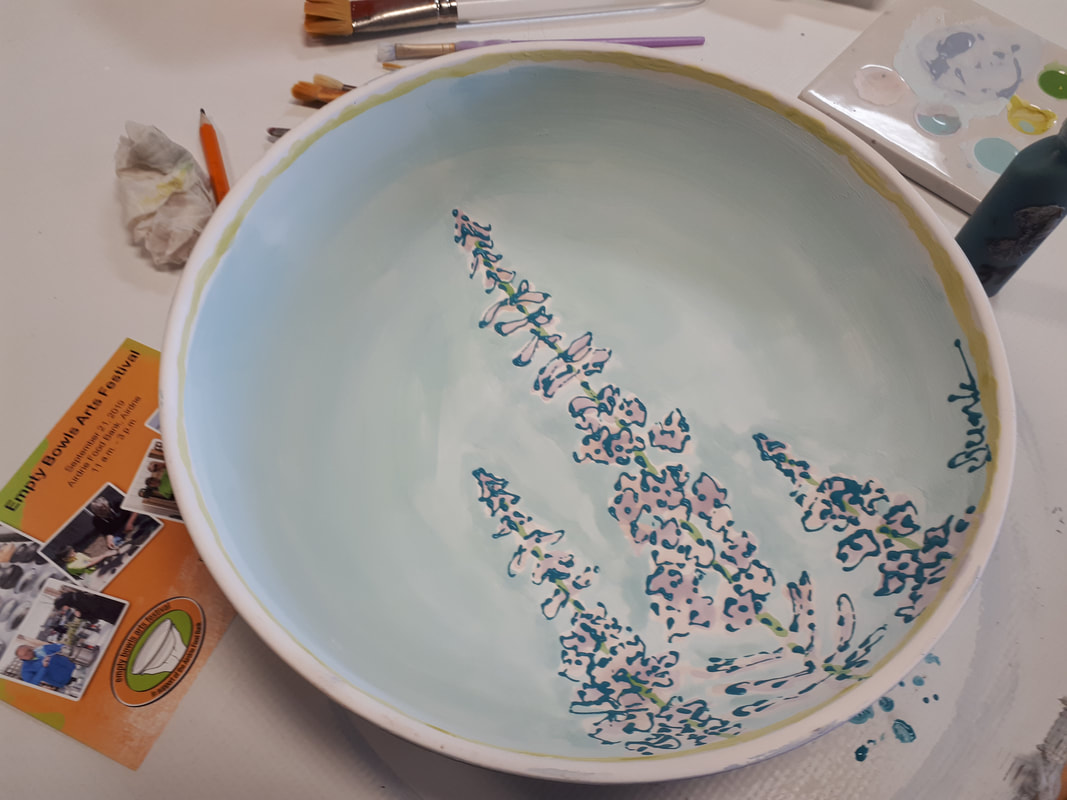
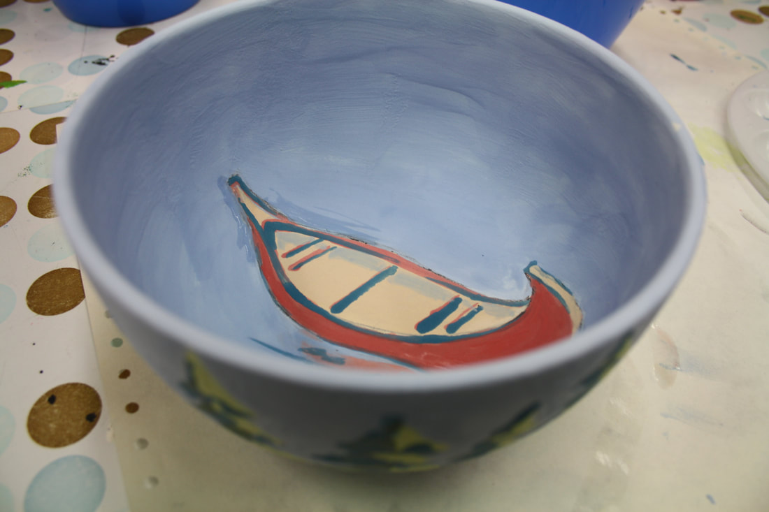
  This is the 9th year I've had the privilege of glazing a bowl for the annual Airdrie FoodBank Empty Bowls fundraiser (unfortunately I didn't get a photo the first year). I decided to focus on the fireweed that has been growing in abundance throughout the Rocky Mountains this year. This collaboration is something I look forward to every year, it really is wonderful to be able to contribute to my community in this way. This year's family fun event will be held at the FoodBank on September 21, 2019.
Over the past few years I have really put a lot more thought into the colours I use, particularly when creating portraits & skin tones. About a year ago I stumbled onto Jane Davenport acrylics, and the colours have been a wonderful addition to my palette even though the paint can appear a bit flat with no sheen, but I'm fine with that. .....
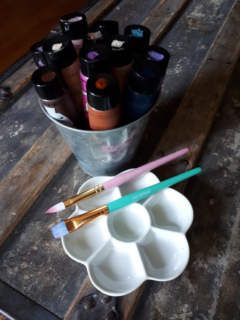
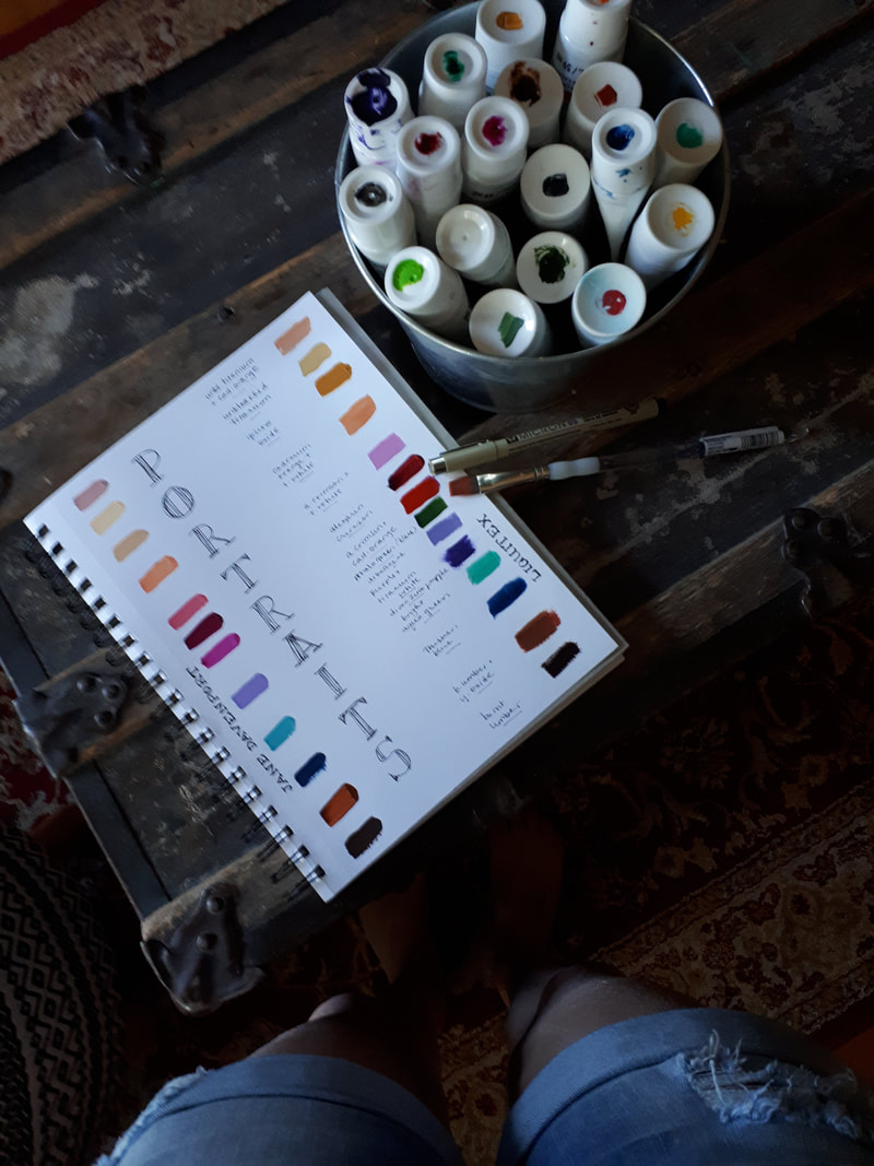
Now that I've painted well over 200 portraits as well as the 'Fashion Plates' series that also incorporates skin tones, I have begun documenting my colour palette. The Jane Davenport colours have blended quite seamlessly and have actually helped me in my colour mixing a great deal. ..... My basic portrait palette includes whites (unbleached & titanium), alizarin crimson (or quinacridone magenta), cadmum-free orange (and/or cad-free yellow medium), burnt umber, prussian blue, dioxazine purple, and bright aqua green. These colours tend to shift a bit depending on the originsl skin tones of the subject and the light and on occasion I also incorporate pthalo green (blue shade) and vivid lime green occasionally. ..... The Jane Davenport paints were purchased at Michaels and the Liquitex at are available at any art supply stores. 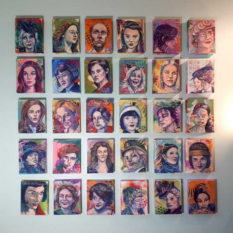 I just noticed that I hadn't shared a completed photo of the 30 day WUNDERLAND project. This one was fun. Definitely not as intimidating as the 52 WEEKS projects nor the 100 Day Nasty Women project (whew!). To see them all separately visit my portfolio here and click on each image if you'd like to read the quotes. A huge 'Thank you!' to everyone who has purchased one of the portraits...you have made my day....my summer actually. Something I'm especially grateful for is the fact that not only do I love creating bodies of work in a series, but receive so much encouragement in the process. I really do appreciate it.
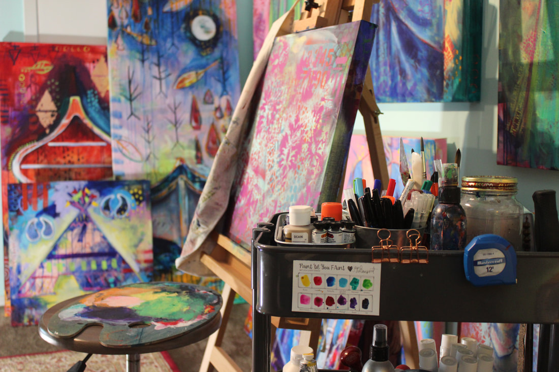
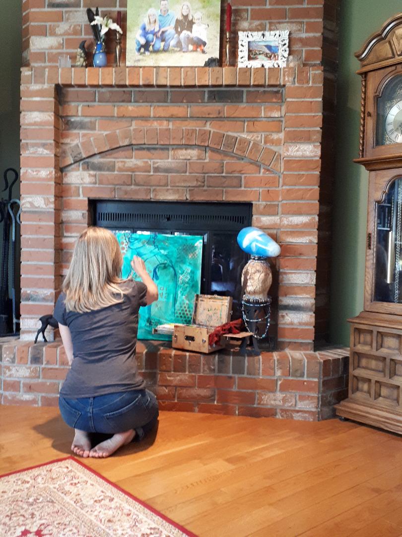 This is one of the places you'll often find me when I'm painting...I actually use my entire house (except for our bedroom...you can't really wipe acrylic paint off of bedding). This is also why I love my little Judson's paint box as I can move it anywhere I want. Occasionally I work in the dining room, often in the kitchen (on smaller projects...great for cooking dinner), sometimes on the back deck, once in awhile in the front yard (I have two Adirondack chairs out front which I have painted), but mostly in my studio. I find when the weather gets warm I just want to move into direct sunlight (our livingroom bay window is south facing) since I my studio is in our basement. Don't get me wrong, it is cozy down there and I do have a nice sized space, but there are times I just need to move around a bit. I find that it helps me to stay motivated, too, since I keep work in progress on our hearth where I end up looking at it a lot. I also have two small rag rugs that I typically carry around to cover my furnishings...but I just noticed it's not on the hearth in this photo. Oops!
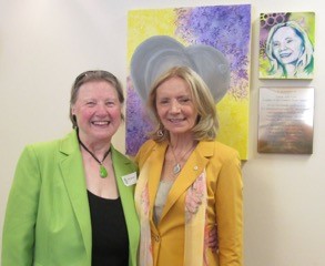 One of the best things to have come out of the Nasty Women project has been seeing the portraits travel to their new homes. This particular piece is now living at the Sobey Cancer Support in Halifax, Nova Scotia. Carol Ann is such an amazing woman...she is the recipient of the Order of Canada as she has raised well over a million dollars for cancer research. I feel so fortunate and very privileged that she reached out to me when I was about to begin my project.
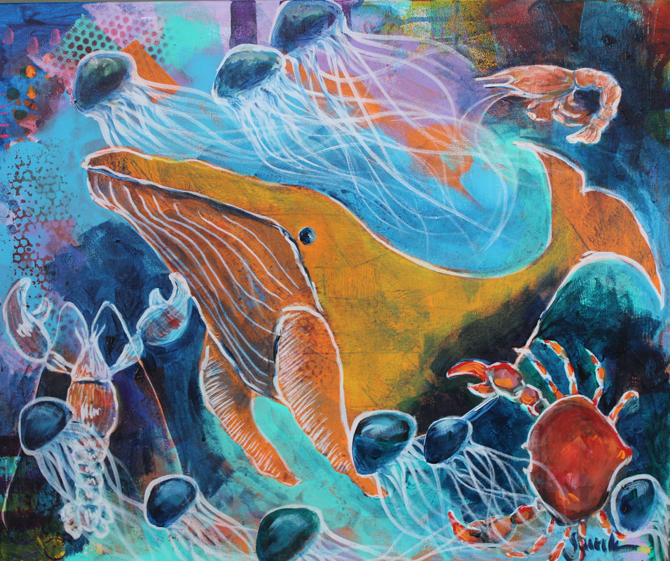 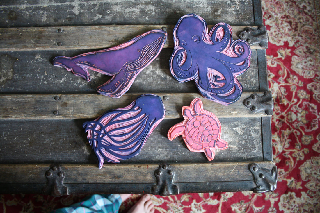 So, last month my daughter had her hand-stamped dresses using environmentally friendly fabrics exhibited in a fashion show at the grand re-opening of Victoria International Marina. I love being able to collaborate on projects with her as I really, really enjoy carving stamps but don't tend to use them. I also created the painting titled 'Under the Sea' which incorporated these same shapes for their fundraiser all about caring for our planet. My daughter has posted a bit about the fashion show on her blog (here) but will be sharing more once she receives the professional photographs.
 A couple of weeks ago I was comparing different acrylic paints, one of them being the Artist's Loft heavy body acrylics from Michaels. I find these colours to be rather transparent (which isn't good when I want opacity) while not being transparent enough (like my Liquitex heavy body that I love) and a little slimy which makes them difficult to mix. They have been great for creating my layers of underpainting, which is fabulous as it does save me a little in the financial department (painting every day can be quite expensive). The other paints I like to use for underpainting are Brea Reese professional acrylics from WalMart and a few craft paints, though they tend to be rather chalky and better for altered books. Finally, I'm loving the Jane Davenport acrylics for portraits...really nice skin tones to mix with my Liquietex.
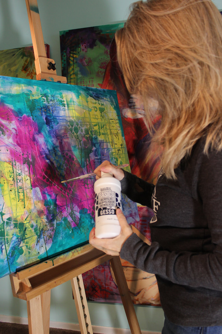 Awhile ago I was in need of gesso but my local art supply store had run out of the professional grade so I picked up the student grade Basics gesso. Unfortunately it isn't opaque and is actually a bit gloopy (I'm not sure if I explained that well) but I'm finding that it works great to create drawings for my paintings. It wipes off quite easily if I'm not satisfied with my initial drawing and if I wet and wipe it immediately and it also blends well into top layers of paint. So, I guess it's not a bad thing...just not quite as useful for what I had intended.
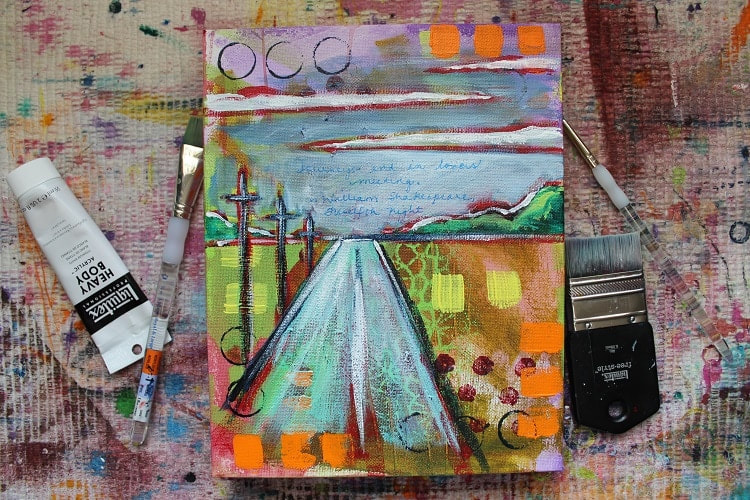
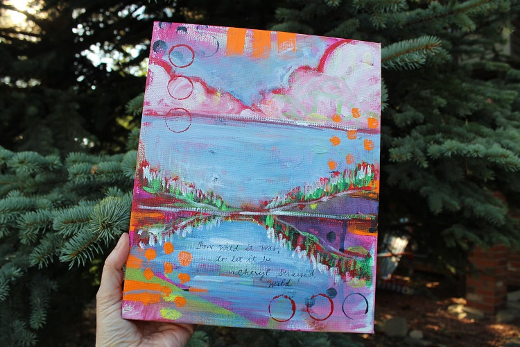
I'm preparing for a workshop next month and have decided to bring several samples along with sketches and a few of my books as inspiration for the attendees. I'm including portraits, canoes, animals, landscapes, and wildflowers in the hopes that seeing some of the things I've been creating will spur the creative juices of other artists. I love creating a vibrantly coloured and patterned background for my pieces as it gives me time to think about what I'd like to create on top of it, plus it always helps reduce my anxiety levels over a blank canvas. I'm really looking forward to it and hope that I can share some words of encouragement.
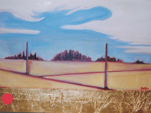
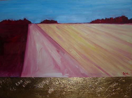
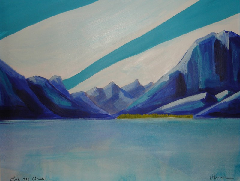
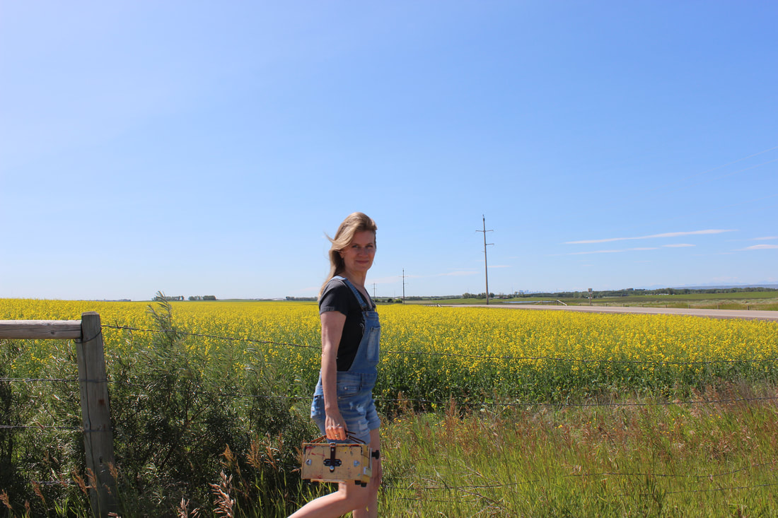 Every year it seems that I discuss working on landscapes again. There is something about all the vibrant colour that surrounds us at this time of year that is so inspiring. I've been looking back at my older work, the ones I have photographs of in any case, and see a connection in this transition so I thought I'd share it. By the way, my paintbox is a Judson's Art Outfitters pochade box...it has been my constant companion for many, many years. Though they create the 6x8 ThumBox a little differently than they used to (mine has more storage), I think it's still pretty fantastic. Though writer Austin Kleon often addresses the fact that everything has been done before (which reminds me of the Biblical adage 'there is nothing new under the sun'), I still do want my work to be recognized as a culmination of personal experience. He also recently wrote about trying to find out something which you don't know. I think that's what being creative is all about. I like that. 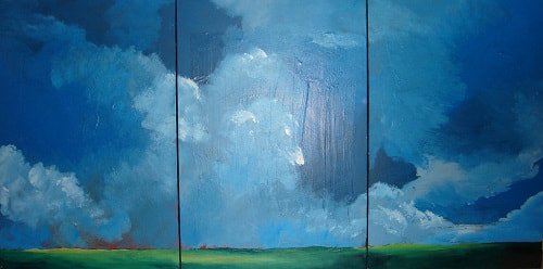 Burning Fields / 40x90 / 1994 I've always been fascinated & slightly intimidated by the landscape. Shortly after college, when I was first married, as I was driving back from my parents' farm at dusk I saw the eeriest but most beautiful sight of farm fields that were deliberately set on fire by the farmers. I had grown up in the north so farmland was new to me...but I loved it. This was a time prior to the internet & cell phones so I couldn't capture the smoke that resembled clouds any other way other than by pulling to the side of the highway to create a sketch which shortly after became this painting. To this day I still carry a small notebook with me at all times to jot down thumbnail sketches for reference. There are times I don't use these sketches for years, but other sketches I often use again & again. There have been many times that I wish I would have taken more photographs of both the inspiration for my paintings and of the paintings themselves. There is something so special about the world we are surrounded by and I know I will continue to try to put onto canvas my experience & awe of it. 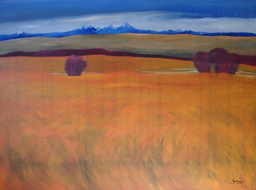 Looking West / 48x66 / 1998 My husband once asked me to paint the view looking west of our home which never ceases to inspire me. I think this might be the largest landscape I have painted to date. I feel so fortunate to be surrounded by prairies & foothills & forests & mountains & lakes & even deserts. The only thing we're missing is the ocean. Blue & orange is one of my favourite colour combinations as I am drawn to complimentary colours. And I find that there is something so soothing about strong lines & hard edges. Autumn is my favourite season and though it is only the beginning of August I can begin to feel it in the air...that's the feeling I get when I look at this painting. 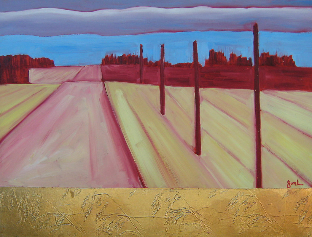
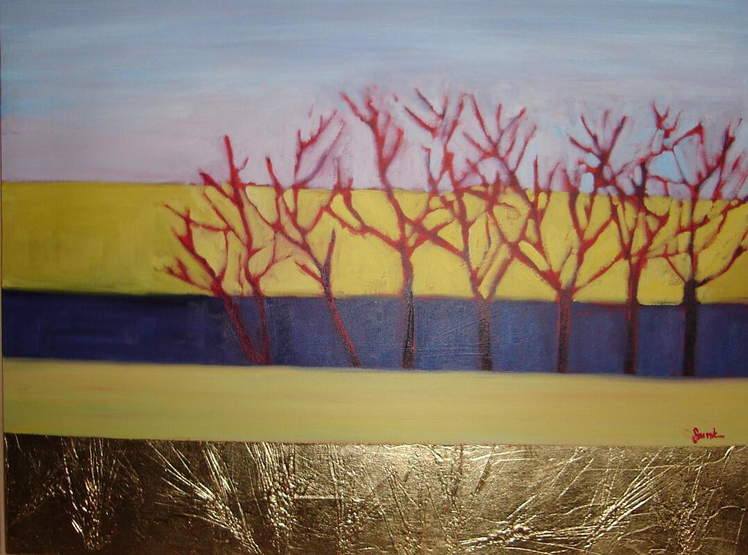
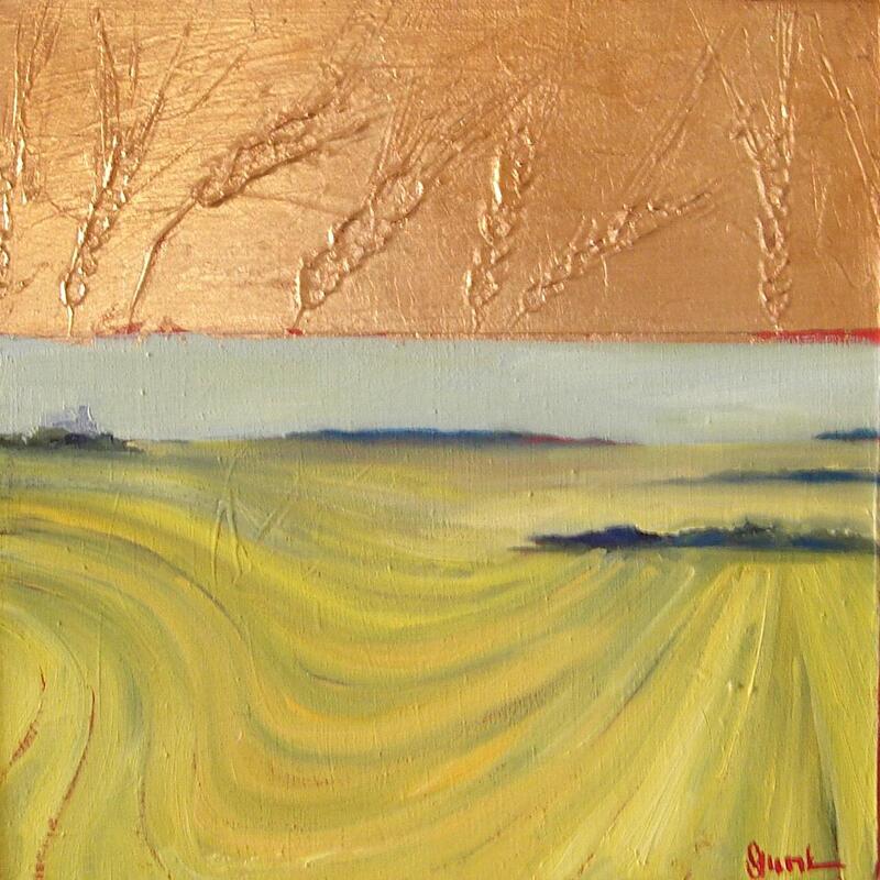
In 2005 our family had an opportunity to live in a farmhouse in Saskatchewan complete with a horse named Centennial, a goat named George, a dog named Bear & a cat named Lucky. The home had a sun porch that was warmed through the winter by the sun and so it became my studio & also a time of experimenting with oil paints. I used M.Graham oils which were so creamy & buttery with vibrant colours that could be cleaned using soap & warm water, which was very important to me. The paintings had a such a beautiful sheen. At this time I was also incorporating mixed media with copper leaf covering the grains I was learning about as I pressed them into modelling paste on the canvases. Whenever I went to sketch the fields, the local farmers nearby would stop & share the history of the area, the things they were growing, and their family stories. It was only one year but it really was a wonderful experience.
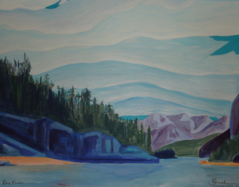
 Rocky Mountains / 70x70 / 2008
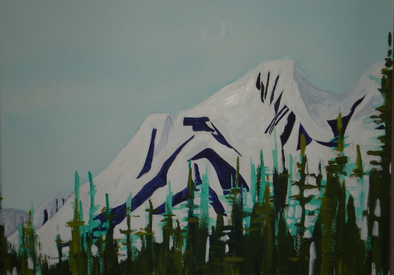
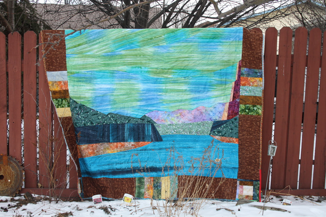
After returning to Alberta in 2006 I spent more & more time simplifying the lines of my sketches & paintings of interiors, canoes & landscapes. This time I returned to acrylics but created these works on paper which were exhibited and sold at the Federation Gallery in Vancouver. At the same time I was working on abstracts & layering patterns & colours. Two such opposing methods of working that eventually connected. One painting in this series even inspired a quilt. Though my palette has only changed incrementally, adding one or two colours occasionally the basic palette has always remained the same and includes a rich blue, originally ultramarine but now either pthalo or Prussian, napthol or cadmium-free red and cadmium-free yellow. Along with titanium white. Through the years, a mentor suggested including transparent colours for glazing so I added alizarin crimson, dioxazine purple & quinacridone magenta, and began incorporating turquoise (aqua green) & brilliant yellow-green. Then when I began painting plein air on occasion about 10 years ago, I started including iron oxide, green gold, sap green, yellow ochre, burnt umber and payne's grey. We weren't allowed to use black in school so I found this grey to be a great alternative and fantastic to tone colours down and deepen them. 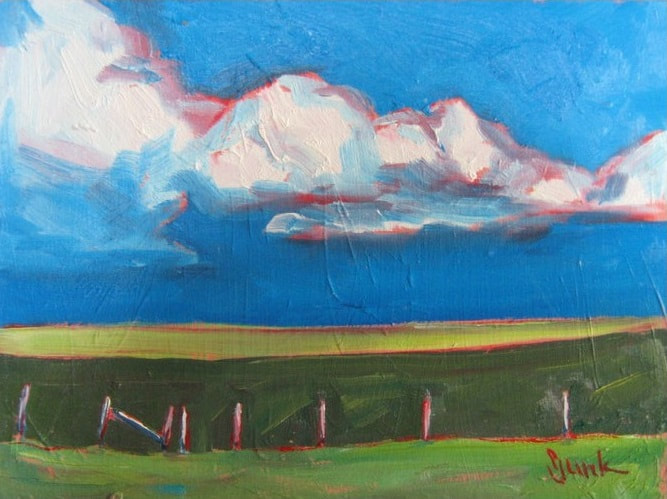 Rolling Clouds / 6x8 oil / 2010 This painting was one of a series of plein air landscapes and a return to oils (acrylics are challenging outside) that became part of an exhibition at the Federation Gallery in 2010. I love using red in landscapes as it can warm all of the cool tones. I also love painting like a colouring book, using strong lines and filling them in with colour. I've tried adding more texture because it is beautiful but find that I prefer creating without. When I found out that a couple from Cochrane ended up purchasing this one in Vancouver I was thrilled as it was painted in the rolling foothills just north of Cochrane. It's interesting how often that happens. 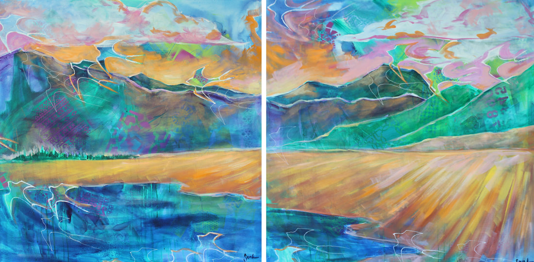 Ghost Lake / 36x72 / 2017 Then, after painting many, many canoes I came back to the landscape...large pieces again. And back to acrylic on canvas. I only painted about a dozen like this, which is very low for me. I may be a bit obsessive as I notice that my series tend to span anywhere between 100-500 paintings though that also includes very small 4x4 paintings to quite large similar to the diptych above. I think it takes me that many pieces in order to figure out my personal voice. When I create a body of work I have learned that I need to avoid looking at artists who work in paint and instead be inspired by other creatives like printmakers, potters, or designers so that I can figure out my own visual voice. 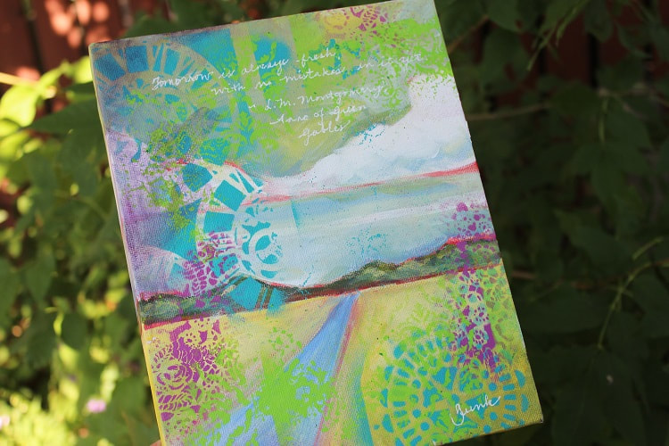 Tomorrow is always fresh with no mistakes in it yet. ~ Anne of Green Gables / 8x10 / 2017 When I created my 52 WEEKS::Storytellers series in 2017 I had included a few landscapes that incorporated spray paint & stencils. I really love how they turned out. I have been playing with colour & pattern being inspired by our unusually lush landscape this summer. One challenge is taking the things I've learned in the past and moving forward. Taking the simplicity of some of my imagery & being true to my history. From the quilts in my family that have been inspiring me for years to the land around me. I've also been paying attention to those beautiful layers again and am looking forward to seeing how the linear sketches I have gathered throughout all of these years will translate.
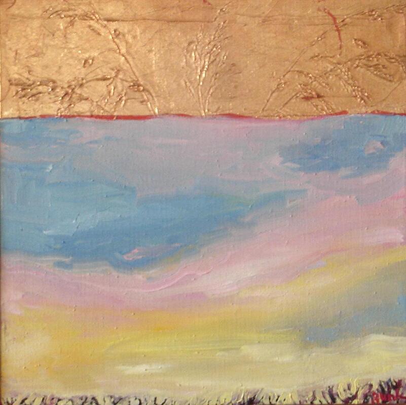
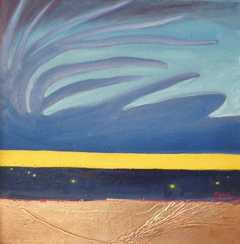
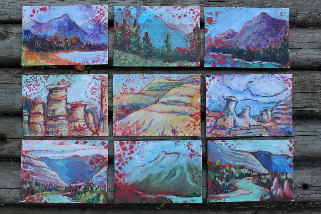 Last summer I began working on a series of landscapes featuring the places I had been spending time around my province. Because they were so small, painted using Golden OPEN acrylics on 5x7 canvas wrapped panels, I was calling them my postcard paintings. I was having fun translating this region into more pastel colours and really liked how they turned out but did miss working on stretched canvas...my favourite substrate.
This is just an overview of the journey through landscapes that I have been on. There were many paintings that were sold or destroyed and many more that were badly photographed, not photographed at all or haven't been included here. I think I'm heading in the right direction with the work I'm creating now. It's always a challenge to push myself in a bit of a new direction while hanging on to the parts of the process that I really, really love. I think it's the vastness of the landscape has always been a bit intimidating to me or the fact that it has been painted so many times throughout the years. I also tend to prefer painting in my studio so that can be difficult, too. I think I might need a cabin in the mountains with a beautiful studio view. :) |
|