::VERONICA FUNK::
Journal
Portfolio
A Room of Her Own
Portraits
>
Ahead of Her Time
Extraordinary Women
Grandmothers
Heroes
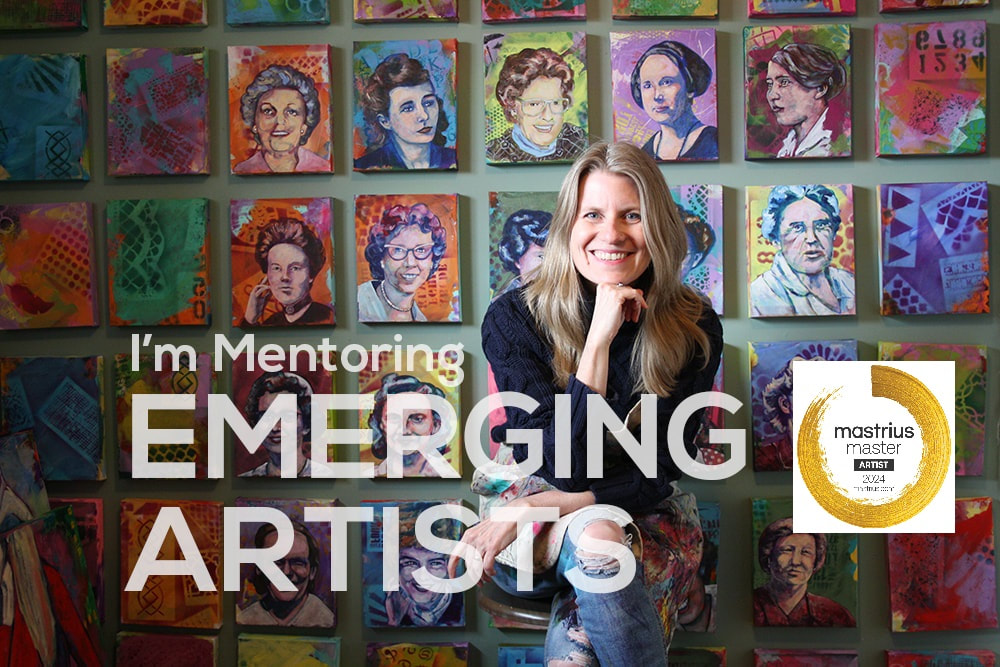
Mastrius Women
Nasty Women
Pocket Portraits - 100 Women Artists
Postcard Portrait Project
The Women
Women of the West
Woman's Work
Wunderland
52 WEEKS
>
Art Journals
Gratitude
Storytellers
Wild
Wildflowers
Fashion Plates
Sacred Vessel
Simple Pleasures
Curriculum Vitae
Galleries
Free Resources
Info for Artists
Painting Animals
Painting Art Journals
Painting Backgrounds
Painting Bees
Painting Canoes
Painting CityScapes
Painting Flowers
Painting Hearts & Houses
Painting Landscapes
Painting Portraits
Travel Journalling
The Business of Art
Contact
Journal
Portfolio
A Room of Her Own
Portraits
>
Ahead of Her Time
Extraordinary Women
Grandmothers
Heroes
Mastrius Women
Nasty Women
Pocket Portraits - 100 Women Artists
Postcard Portrait Project
The Women
Women of the West
Woman's Work
Wunderland
52 WEEKS
>
Art Journals
Gratitude
Storytellers
Wild
Wildflowers
Fashion Plates
Sacred Vessel
Simple Pleasures
Curriculum Vitae
Galleries
Free Resources
Info for Artists
Painting Animals
Painting Art Journals
Painting Backgrounds
Painting Bees
Painting Canoes
Painting CityScapes
Painting Flowers
Painting Hearts & Houses
Painting Landscapes
Painting Portraits
Travel Journalling
The Business of Art
Contact