|
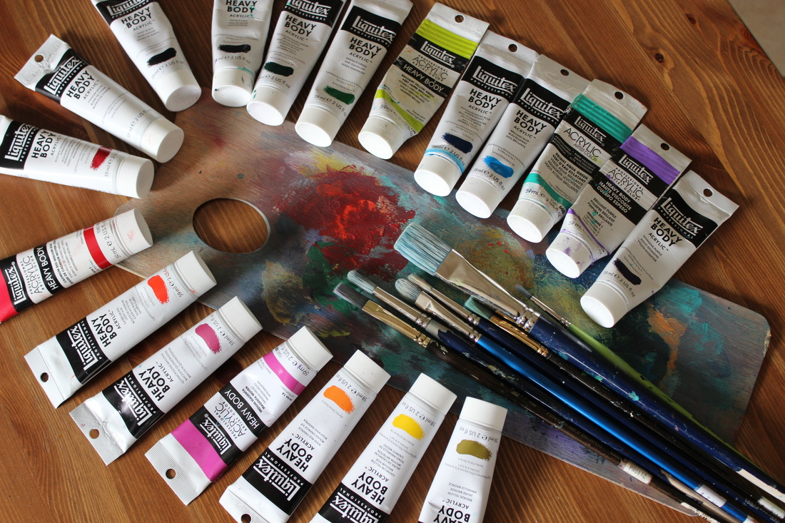
I'm often asked about the colour palette that I use, and though it used to be straight forward it has changed drastically over the past three years. I tend to snag whatever grabs my fancy and also look for sales whenever I can. I do like a balance of warm and cool colours and also a variety of transparent and opaque. Right now my palette consists of (clockwise from the bottom):
* bronze yellow (opaque) * cadmium yellow medium (opaque) * vivid red orange (transparent) * medium magenta (opaque) * quinacridone magenta (transparent) * cadmium red light hue (opaque) * cadmium red medium (opaque) * alizarin crimson (transparent) * titanium white (opaque) * ivory black (opaque) * payne's gray (transluscent) * pthalocyanine green (transparent) * emerald green (opaque) * brilliant yellow green (translucent) * pthalocyanine blue ( transparent) * brilliant blue ( opaque) * bright aqua green (opaque) * brilliant purple (opaque) * dioxazine purple (transparent) I usually tend to stay away from cadmiums for my own health but the colours are so vibrant...I tend to use napthol crimson or pyrrole red and yellow medium azo instead but when there's a sale, I take what's available. I absolutely love quinacridone colours, and also like to incorporate quin burnt orange. My absolute favorite colours are alizarin crimson, pthalo or Prussian blue, dioxazine purple, brilliant yellow green, green gold and bright aqua green and they change so beautiful when mixed with one another or with white. Another creamier white I like to use is unbleached titanium. I've added ivory black (I've been enjoying payne's gray but wanted some opacity) as well as pthalo green and bronze yellow recently and I'm not sure about them yet...only time will tell. After seeing so many beautiful pieces by other artists, I've also tried iridescent metallic colours but I'm not that fond of working with them myself. As you can see, my palette isn't traditional as I tend to prefer luscious, vibrant colour rather than earth tones. I sometimes think it's because I really began painting daily once I had my children and what they were drawn to certainly influenced me. Hard to believe sometimes when I look into my own closet where everything is black, grey, navy and brown. I'm guessing it's the lack of colour in my daily life that demands vibrant colour in the artwork I place on my walls and that I prefer to create. I'm also drawn to cool colours more than warm, but I do realize the need for both. Of the entire colour palette, I would say that adding yellow to my repertoire has been the greatest challenge and I'm not certain why. It's even harder than adding pink, which I had an aversion to for years...and, oddly enough, it has always been my eldest daughter's favorite colour. Though I do like yellow for brightening up greens and oranges. My basic palette used to be just that...very basic. Primary colours in their cool and warm shades along with white, which is great for travelling. These days I find that utilizing a larger colour palette and working straight from the tube has its advantages...something that was discouraged in art school. I like working quickly and can grab a tube to squeeze directly onto my canvas or brush...or on many occasions, my fingertips. Keeps the intuitive process humming along smoothly. Comments are closed.
|
|


