|
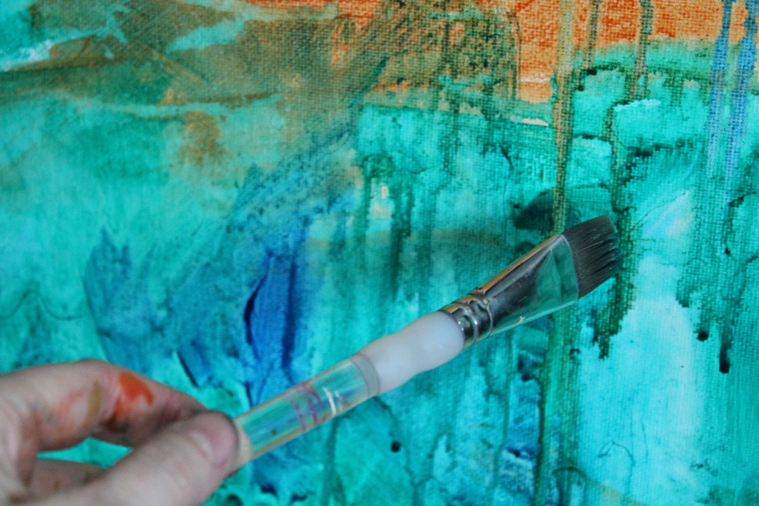
When I'm working in my studio sometimes when I'm experimenting with acrylic inks, spray paint, and layering of pattern and colour I feel a bit like a mad scientist. In that vein I've been working with transparent or translucent colours more often these days. I love how the colours allow the patterns underneath to show, even the colours to a certain extent, and how they bring a canvas together. And they blend together beautifully mixing well with water and leaving vibrant stain on my canvas. Plus when you add Titanium white you can create an entirely beautiful, opaque new colour. My favorite Liquitex heavy body paints are Pthalocyanine Blue, Alizarin Crimson (these two have been in my paintbox for years), Dioxazine Purple, Green Gold, Quinacridone Nickel Azo Gold (this one's a Golden product), Pthalocyanine Green (these I began using a few years ago), Quinacridone Magenta, and Quinacridone Red-Orange (the newest additions to my repertoire).
I've also begun playing with pearl-type colours with a sheen to them and the next acquisition may be iridescent white. It's interesting to me as I used to be absolutely married to the three primary colours (my favorites were Cadmium Red Medium, Cadmium Yellow Medium and Ultramarine Blue as they are the closest to true primaries) along with Titamium White and now my palette has grown exponentially. If a favorite isn't immediately available then I'll grab something new to try out. It's been fun, to say the least, and though not necessarily always initially successful, I eventually find a way to add it to my work. My dream is to receive a gift of all 100 colours of heavy body paint created by Liquitex...along with two dozen large gallery canvases in varying sizes...ahhhhhh, that would be lovely. Comments are closed.
|
|


